As if choosing a website layout wasn’t hard enough, our list of options when it comes to the layout of a site has gotten longer over the years. Gone are the days when everyone had a table based html layout (thank goodness!). We’re spoilt for choice now really when we start to consider what layout would best suit our website. So here are the main ones:
Full Width
Full width website layouts are really common. They fit the full width of your web browser. They’ve become a staple part of the website design diet. full width website Choosing a website layout
Fixed Width
Fixed width website layouts are also pretty common, but are becoming less so. Their width is normally set to 960 pixels, which gives a more magazine style boxed off website. Fixed width websites can look really good, especially if the background you choose fits the website design well. fixed width website Choosing a website layout.

One Page
One Page sites are surging in popularity. They’re pretty fresh right now. Instead of the traditional websites where you’re taken to a different page when you click a heading in the navigation bar, your browser will scroll down to a corresponding section on the homepage. It means the homepage contains all the information needed and eliminates the need to have a mess of pages. Works best on websites with about five or so headings in the navigation bar. Anymore than about seven and things start to get confusing.
Parallax Scrolling
Parallax sites are also surging in popularity, especially when teamed up with a One Page layout. Parallax is when the background image scrolls more slowly than the website does, creating a more dynamic feel to a website layout.
Parallax Slide
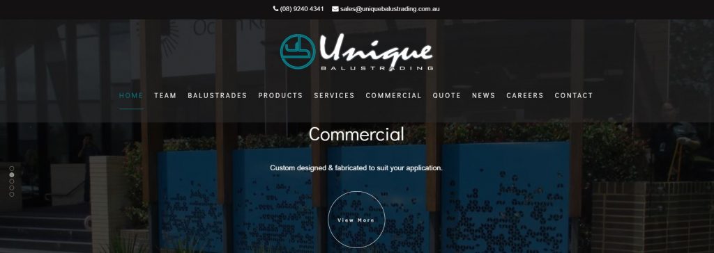
Parallax Slide sites are when a site uses a full-width slider to greet their user. Our own website is a good example of this. Parallax Slider website Choosing a website layout.
Parallax Video
Parallax Video sites are much the same as a Parallax Slide layout, only a video is found in place of a slider.


